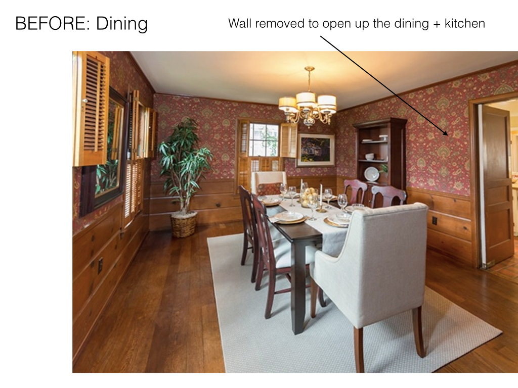
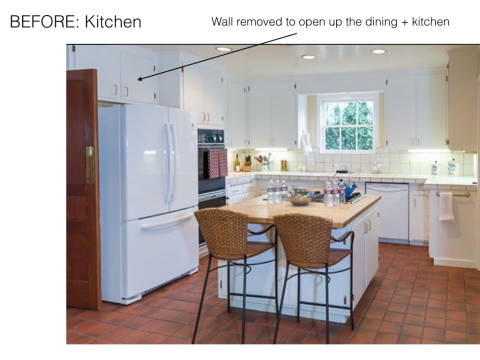
By now you’ve seen just about every room in our downstairs sprinkled throughout various blog posts (or maybe you saw this recent feature on My Domaine!). I’ve been taking my time decorating since we moved in this past October and finally felt like the downstairs was complete enough to share. Minus a few blank walls of course, but time, travels and memories will fill those! Ask and you shall receive–sharing before and after photos so you can really get a feel for the renovations we made. We couldn’t be happier with how everything turned out!
I’ve always loved older homes and my guy and I fell for this 1940’s charmer right away. It had amazing potential (the natural light in the family room sold us) but the kitchen and bathrooms needed some love. Everything was dark wood paneling and floral wallpaper before we moved in so my main goal was to brighten the space and make each room comfortable and practical. We worked closely with our friend and interior designer, Deborah Costa of Design Alchemy, to make our vision come to life. I can’t say enough amazing things about her work and how much she helped make this process stress free for us. Even if you think you have an eye for decor and design, undertaking a remodel on your own can be daunting and we couldn’t imagine doing it without her or our talented contractor. Plus, Deborah has gotten to know my style so well over this past year that moving forward with the upstairs remodel has been an even smoother process!
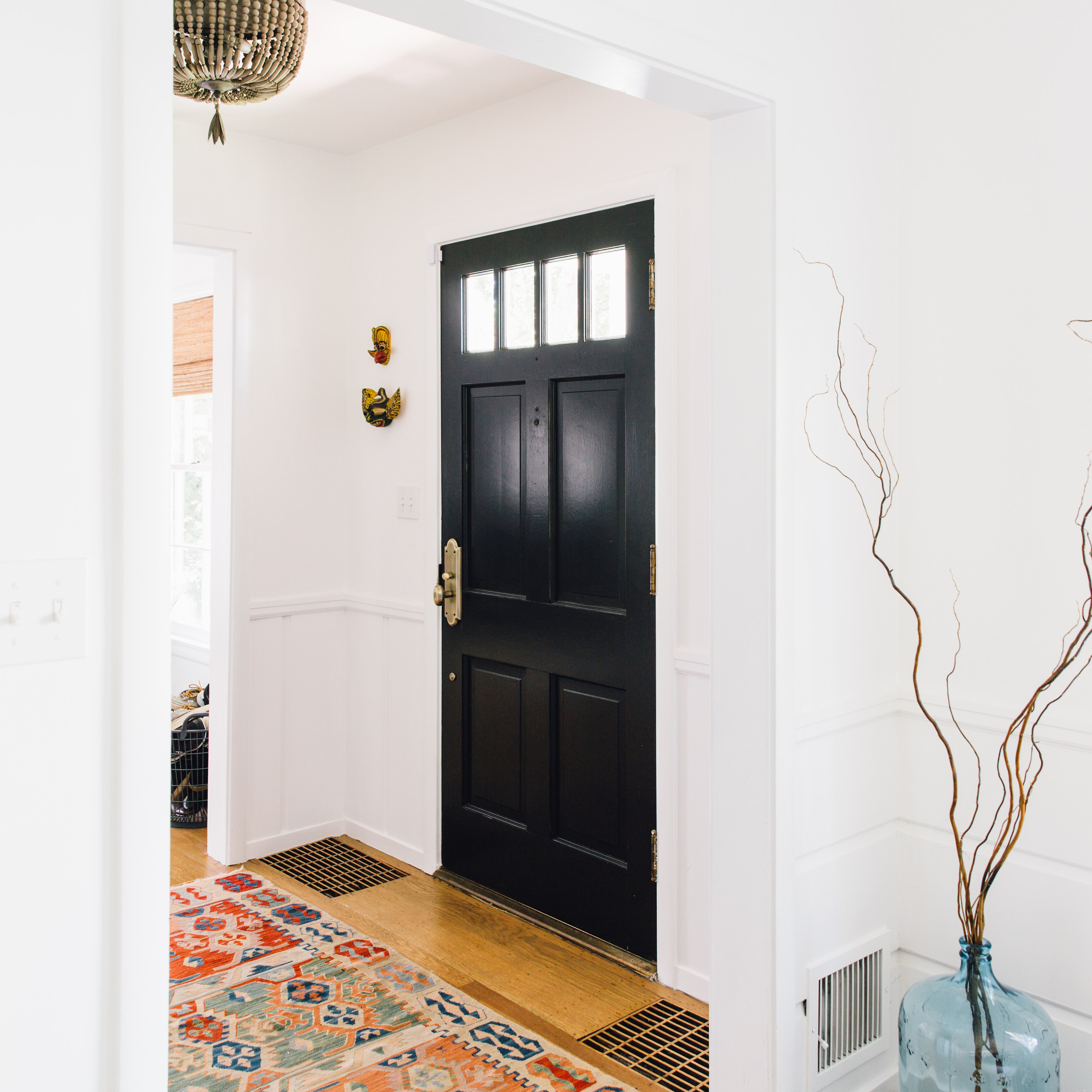
The dark wood paneling was painted white throughout (and the back of our front door black for contrast). As you’ll see white and black are my main colors creating the ideal canvas for decor.
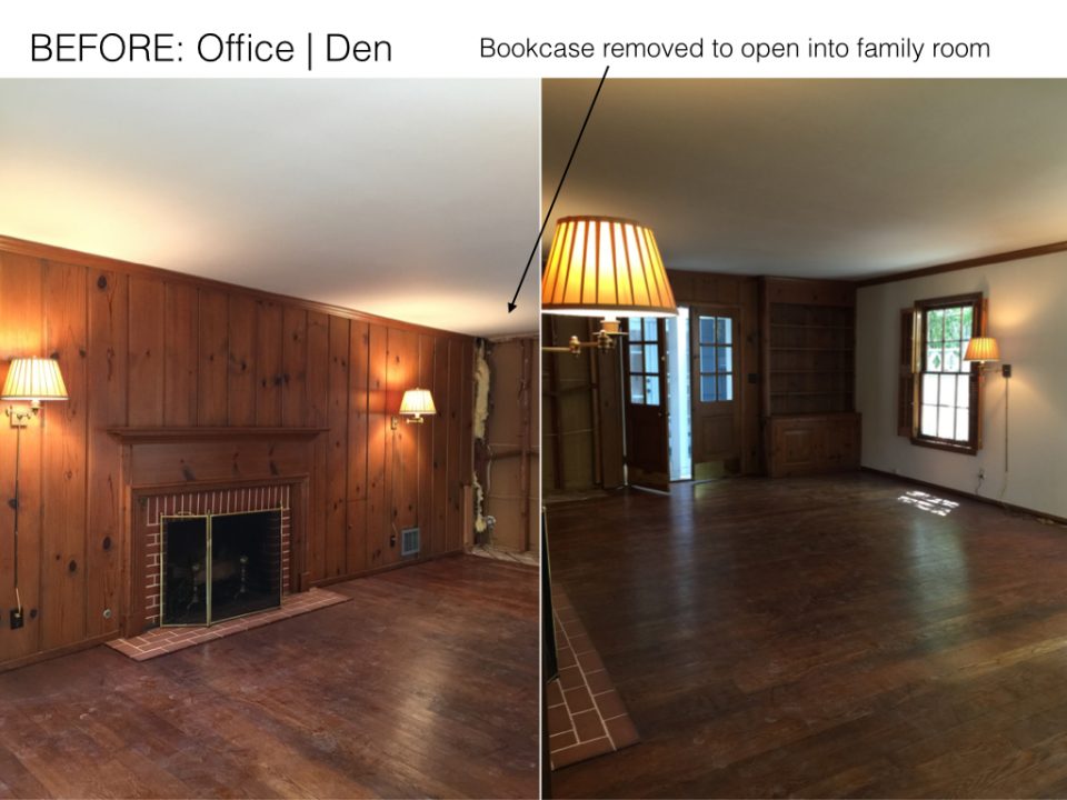
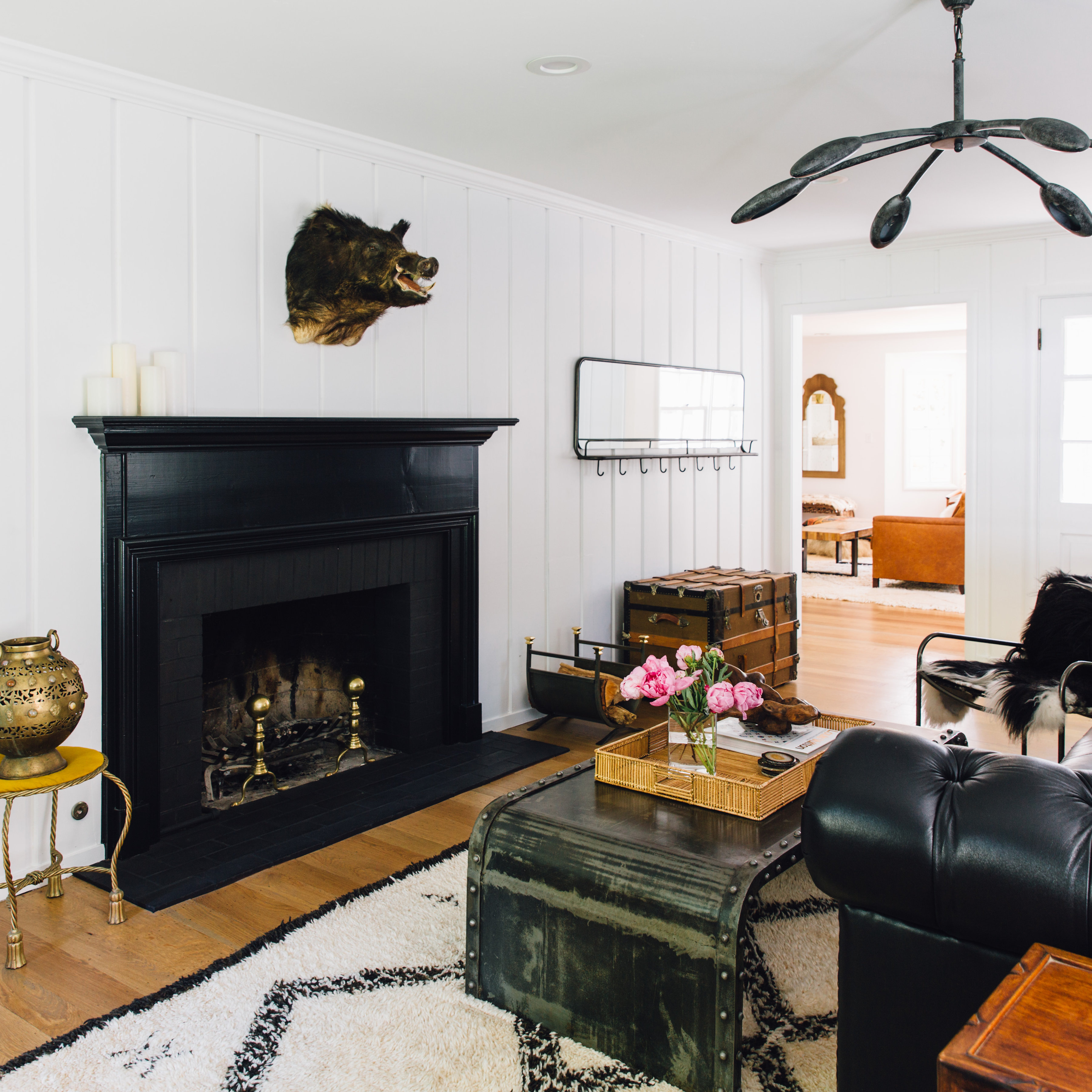
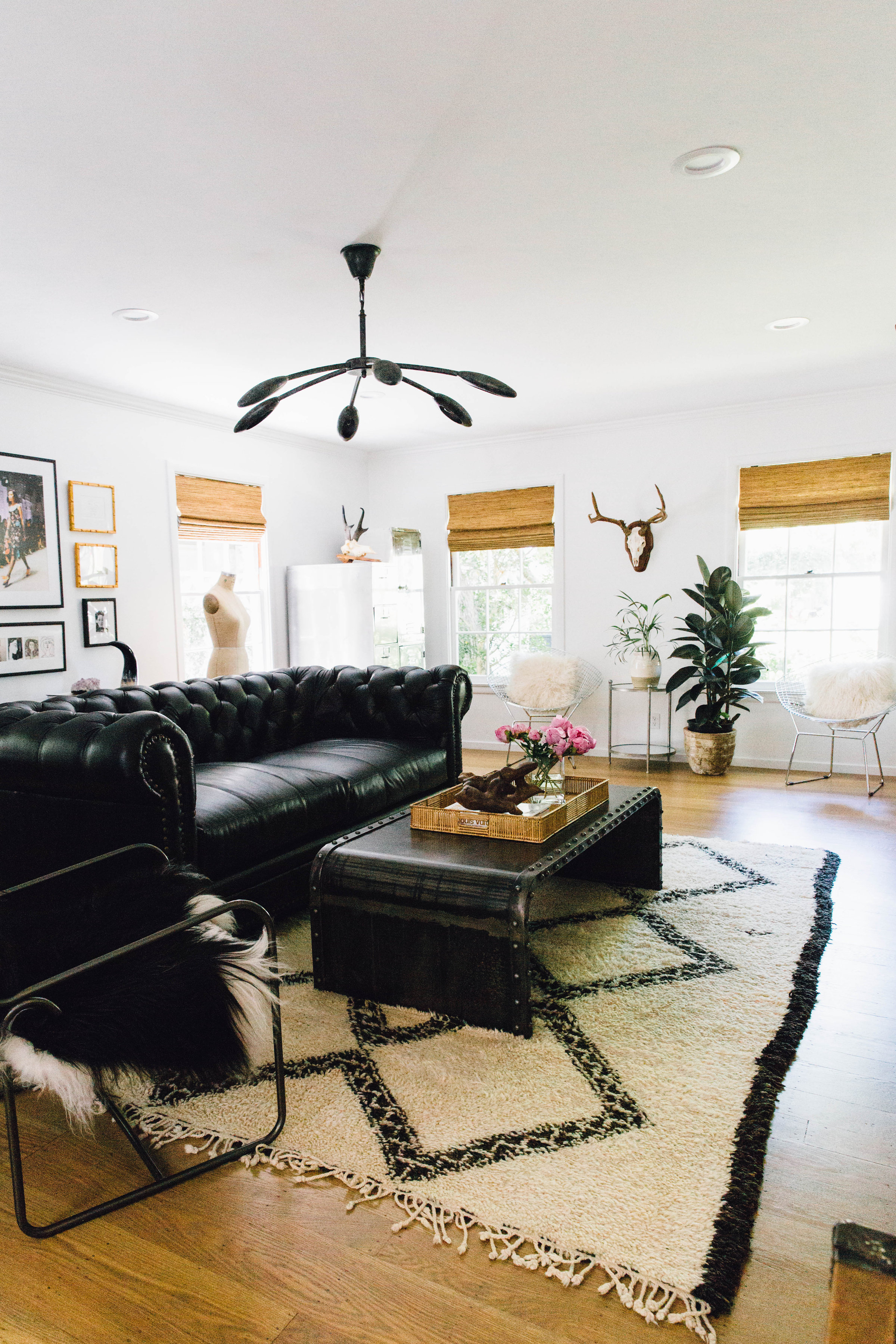
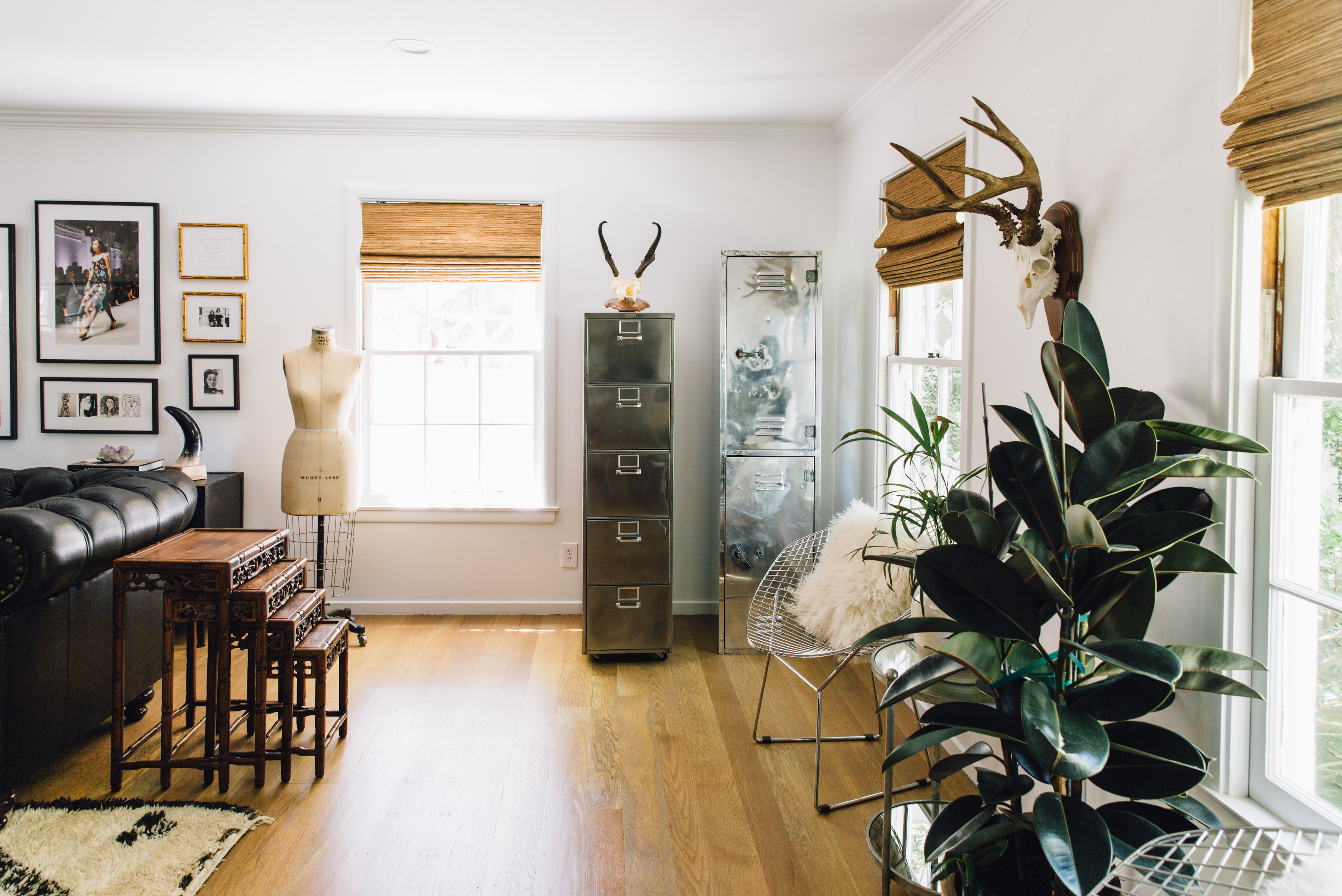
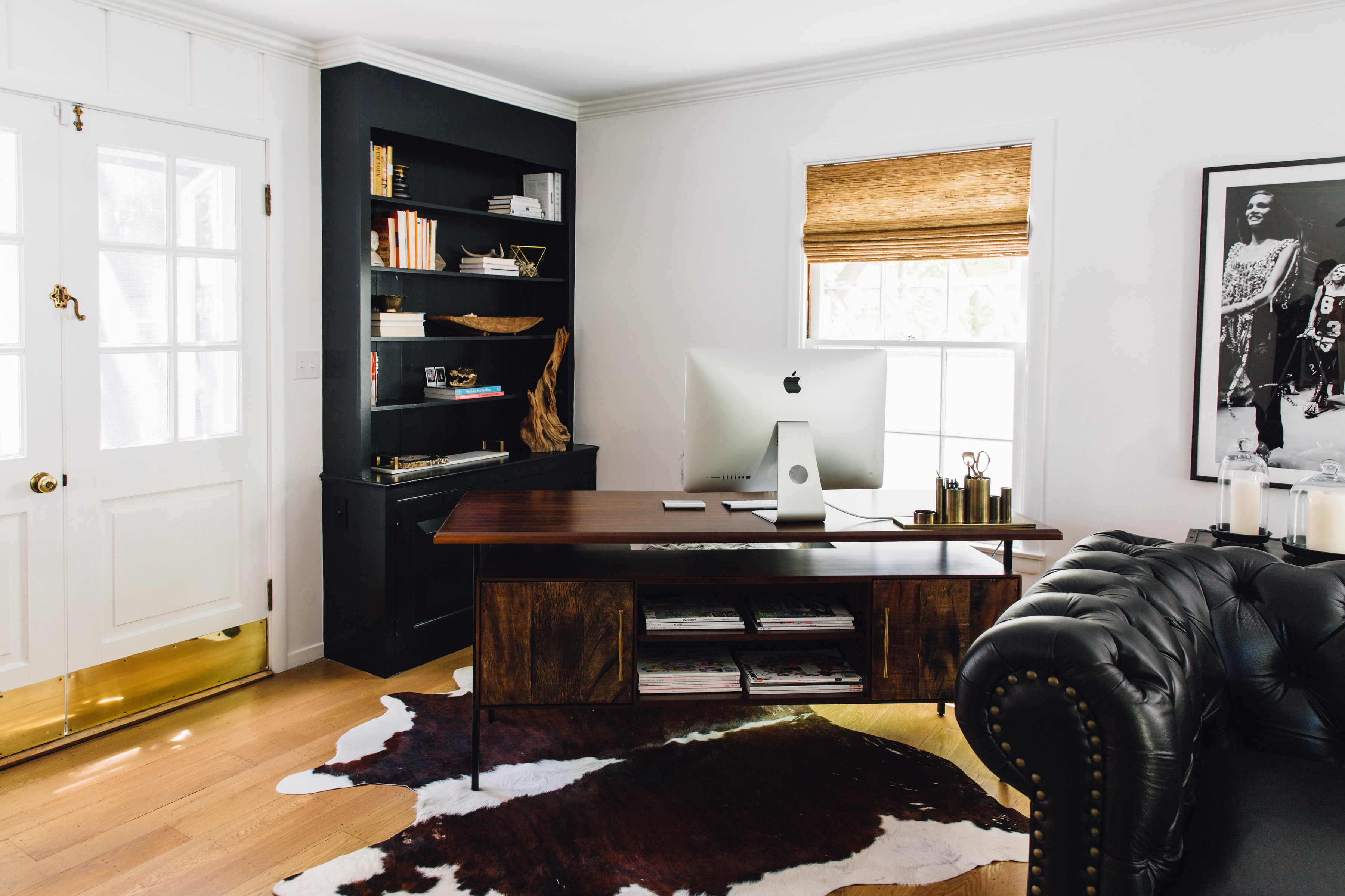
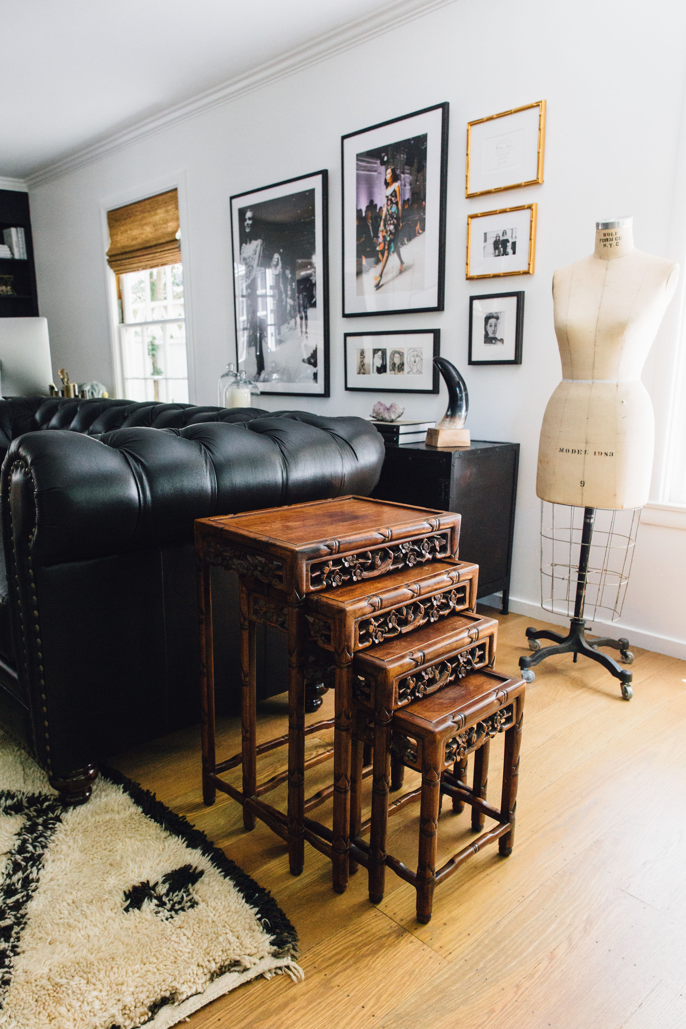
The Office / Den | Our den / my office is my favorite room in our house. (Remember when I finished off the room by creating this gallery wall?) I love it the most because it really feels like the perfect masculine meets feminine mix of my guy and I. Besides my desk and the chester leather couch, almost everything in the room we had previously or inherited from our families. It’s quite eclectic and yet everything seems to work perfectly creating just our vibe.
This room was originally a formal living room. Since we’re not formal people we decided to turn it into a multipurpose room that I could work from as well. The game changing factor of this room–besides painting all of the dark paneling white and adding recessed lighting–was opening up the wall leading into the main family room. All of which added so much more light to this space.
The floors were refinished and stained a lighter shade (this was carried / matched throughout the downstairs). The walls and wood paneling painted white, and the fireplace and bookcase were painted black for a dramatic pop. The lighting was replaced with a cool ceiling fixture that Deborah helped me source, and recessed lighting (huge difference). We also replaced the wooden shutters with woven blinds for a more modern feel.
Details | Couch, Desk + Lighting: Design Alchemy. Rug: Kechmara Designs. Coffee Table: (older) Nantucket Home. File Cabinet, Locker + Chest: Vintage. Wire Chairs: Lulu & Georgia
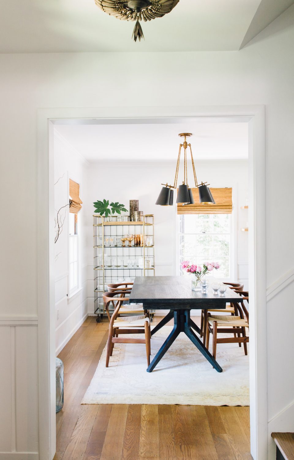
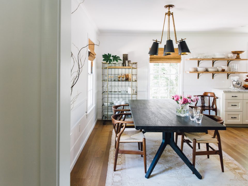
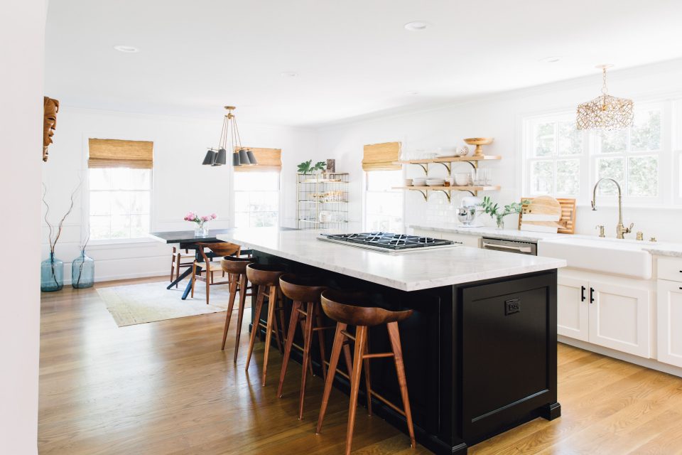
Dining / Kitchen | Opening up the dining room into the kitchen was really game changing. A lot of older homes have more formal rooms and the easiest way to create a more open flow and feel is to open the walls where possible.
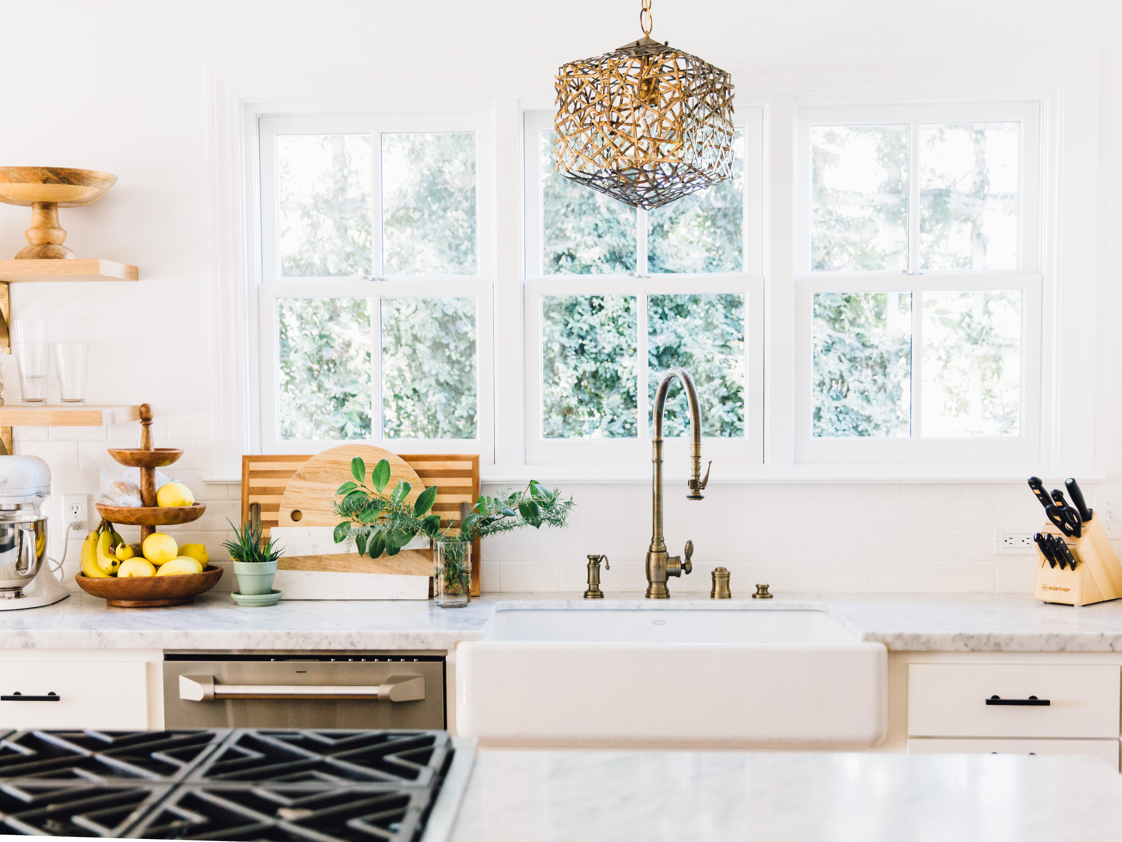
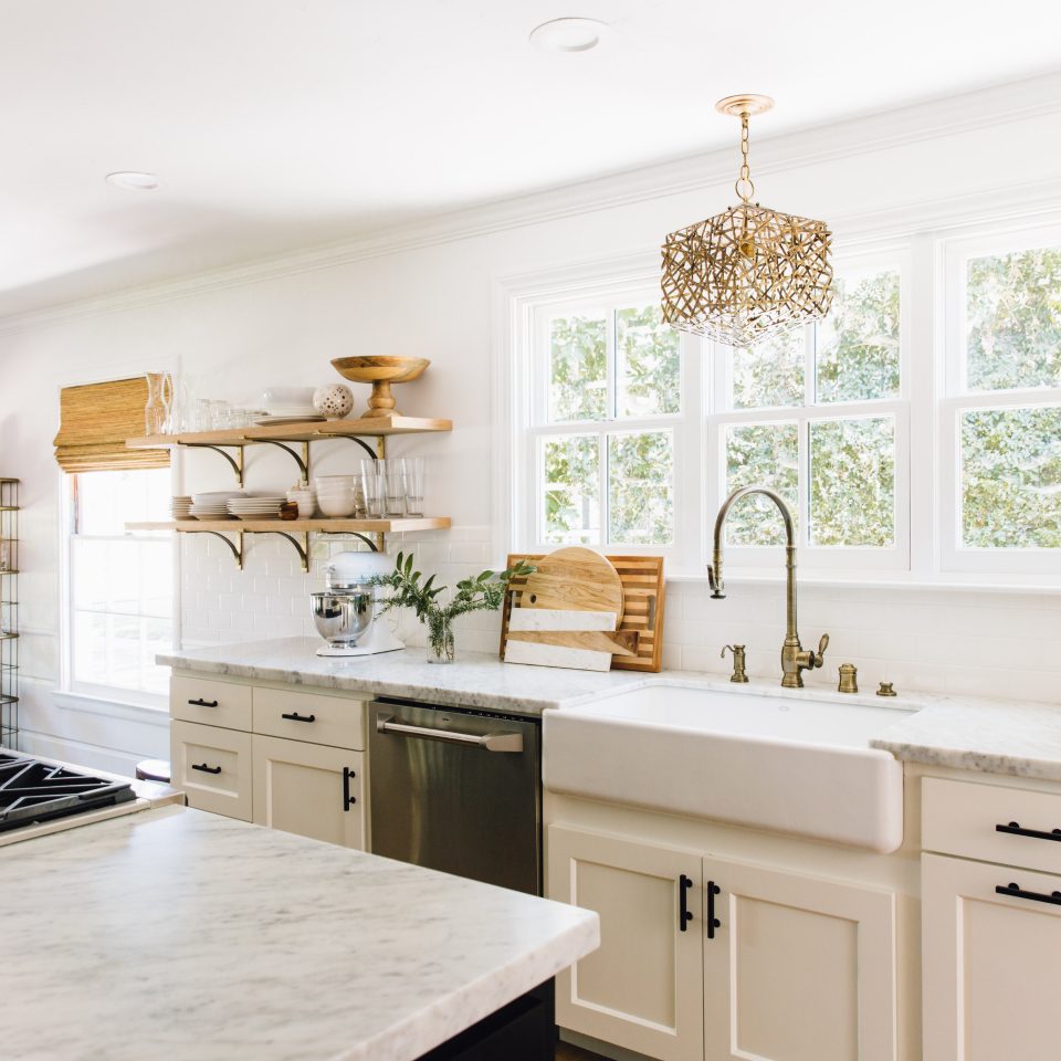
Once we tore down the wall separating the dining room and the kitchen we reconfigured the appliances, extended the island, and enlarged the window (major for letting in more light!). Since the flooring was tiled in the kitchen we matched the original hardwood in the dining room, sanding and staining, to carry this through to the family room.
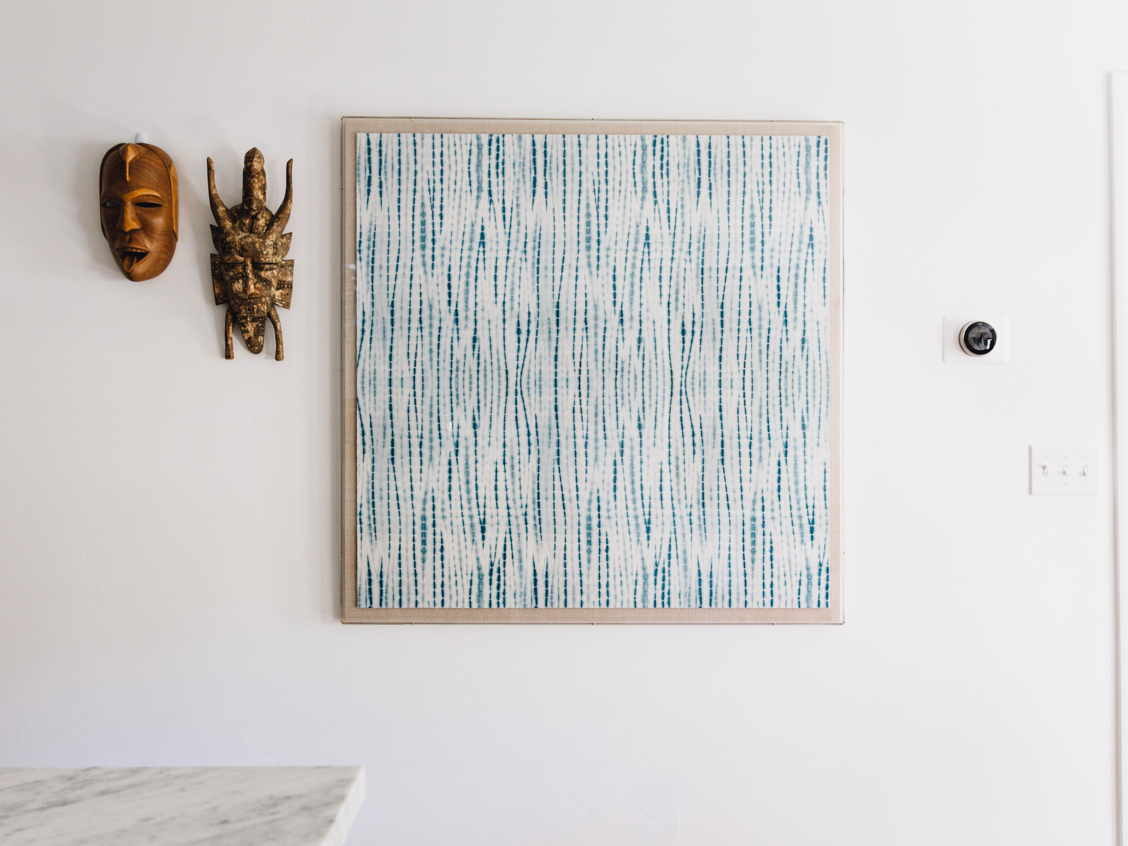
One of the walls I still need to fill. The indigo is from St. Frank and the African masks are from my husband’s grandparents.
I went back and forth on whether to paint the island black or stick with white and I’m so glad we ended up going black. It just seems to really pop. In an effort to make the kitchen feel as open as possible I knew I wanted to go with open shelving. I’m such a fan of the open shelving because it really helps keep us clean and organized.
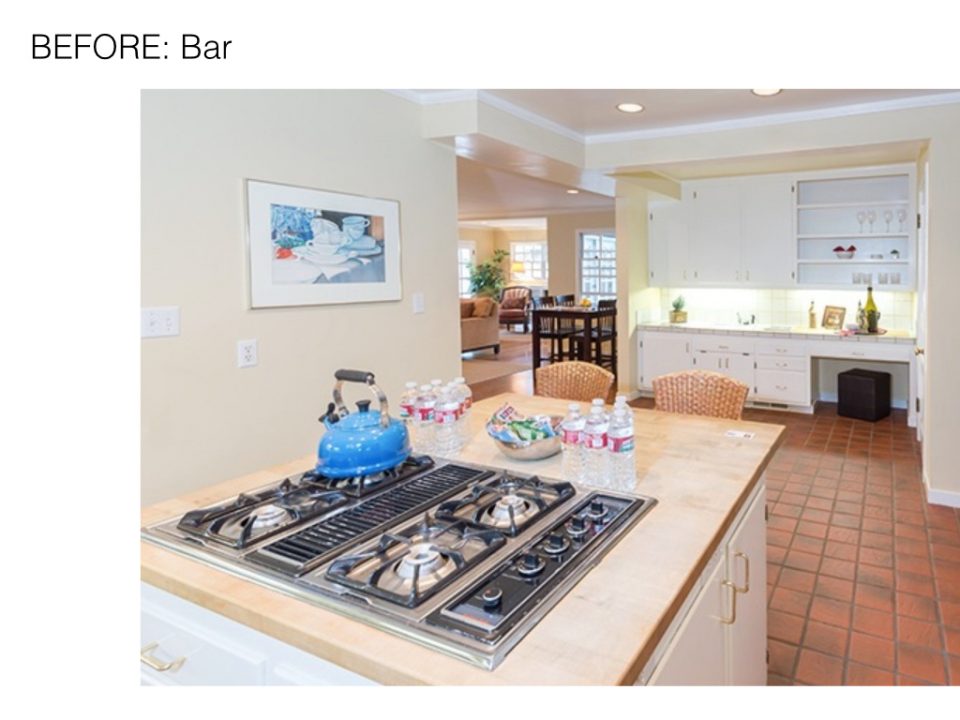
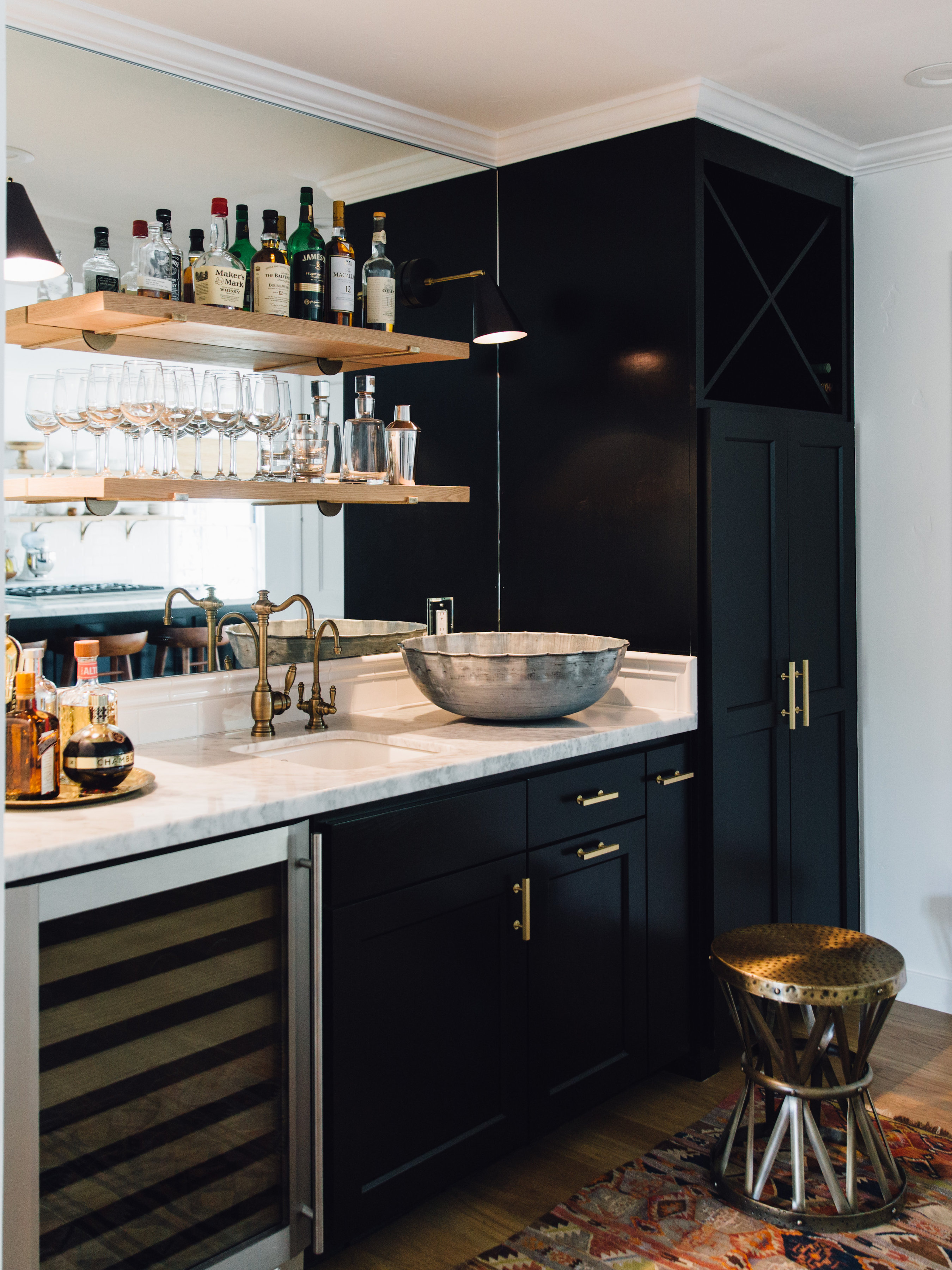
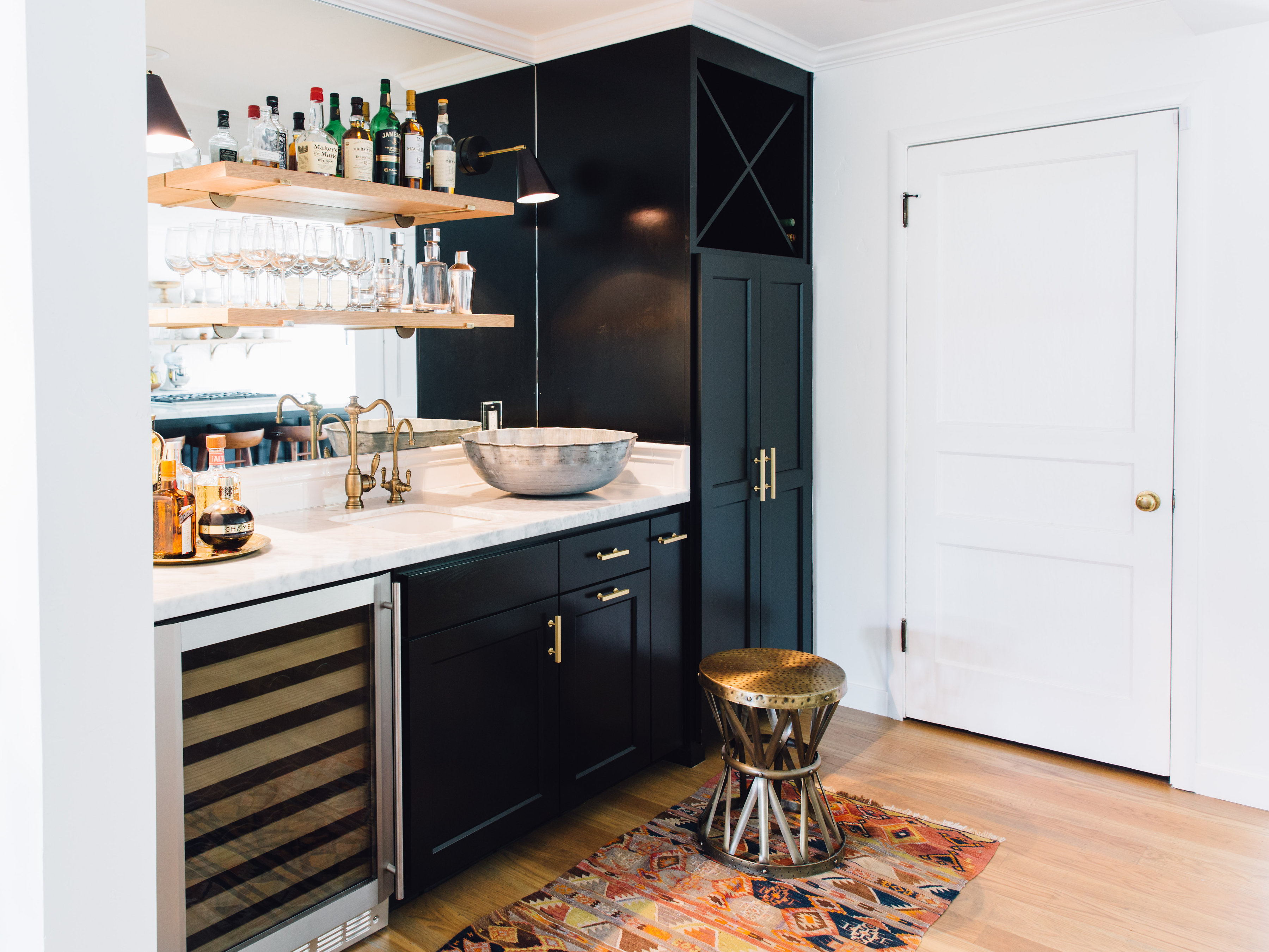
Bar | The back of the kitchen leading into the main family room had a desk / bar area that we opted to jazz up. We reconfigured the space removing the shelving and adding the mirrored wall and open shelving which makes the space feel larger. Painting the bar and opting for brass hardware as opposed to the black we used in the kitchen really defines the space.
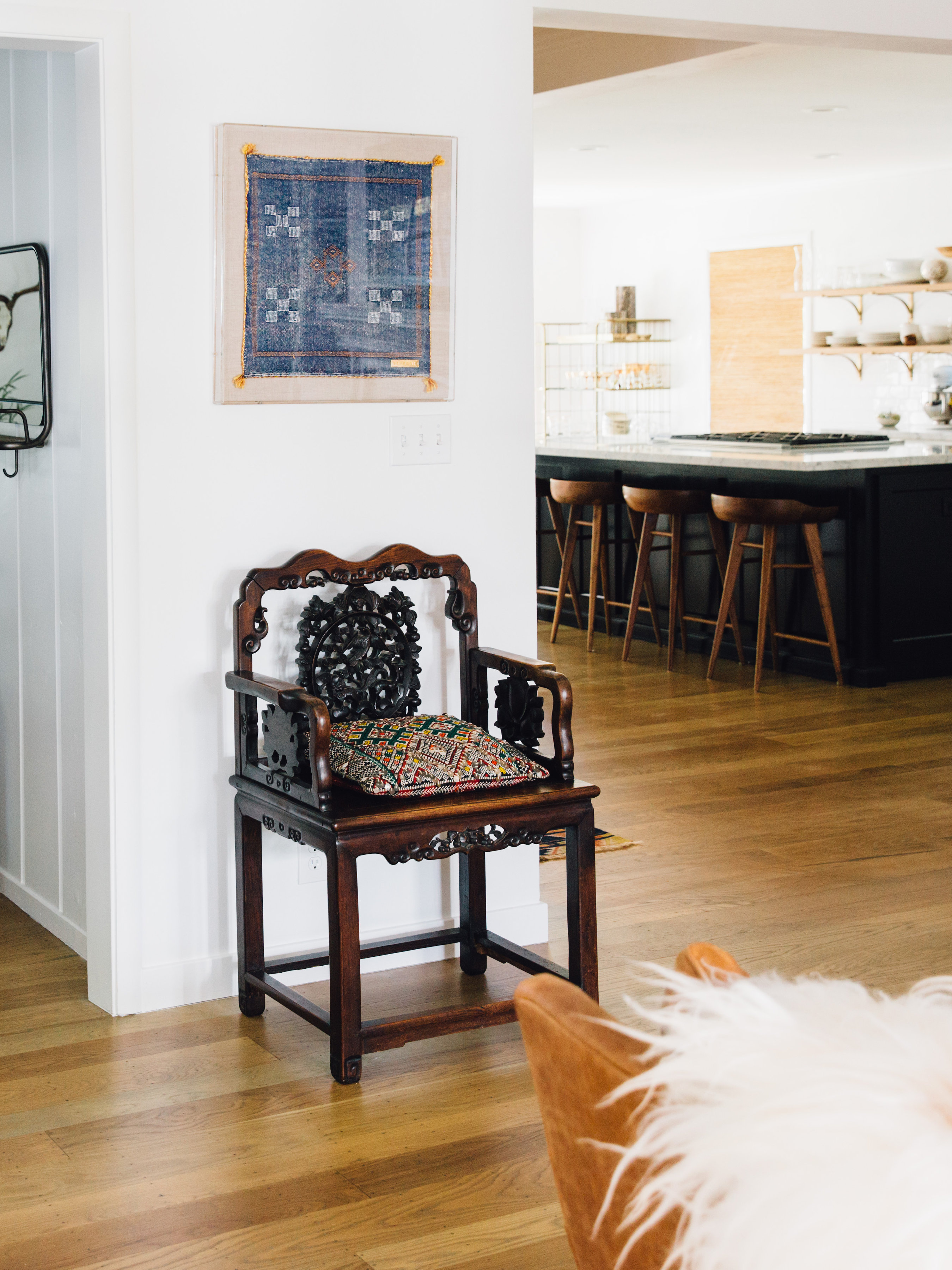
Details | Chinese Chair: Inherited. Framed Textile: St. Frank
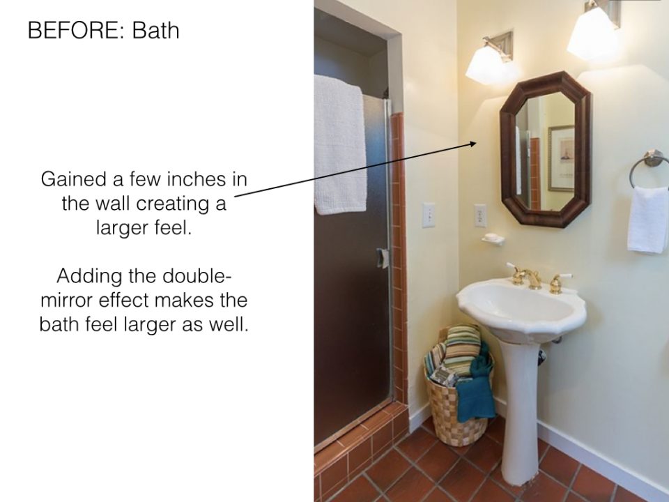
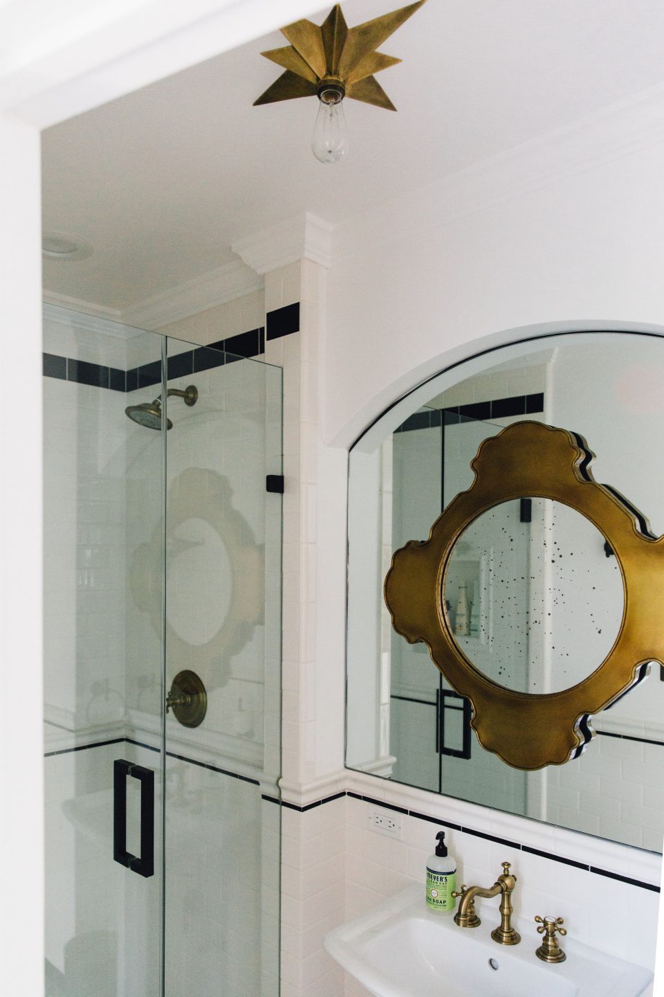
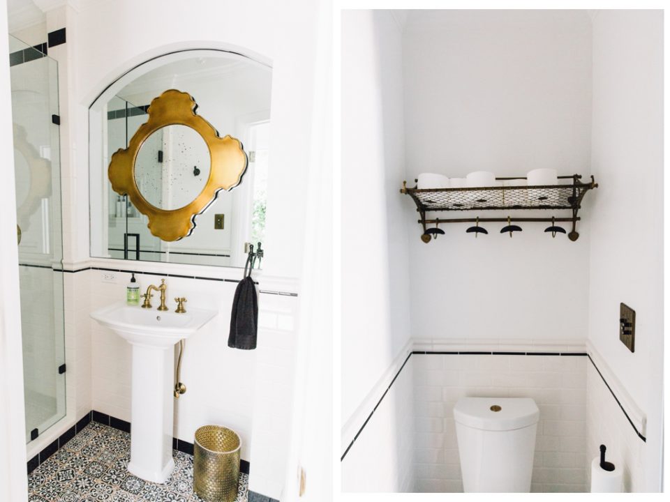
Powder Bath | Besides the obvious aesthetic upgrades we made to the downstairs bath: new tile, vanity and fixtures. The main goal was to make this powder feel larger. Gaining a few extra inches to recess the vanity and adding the mirrors made all of the difference.
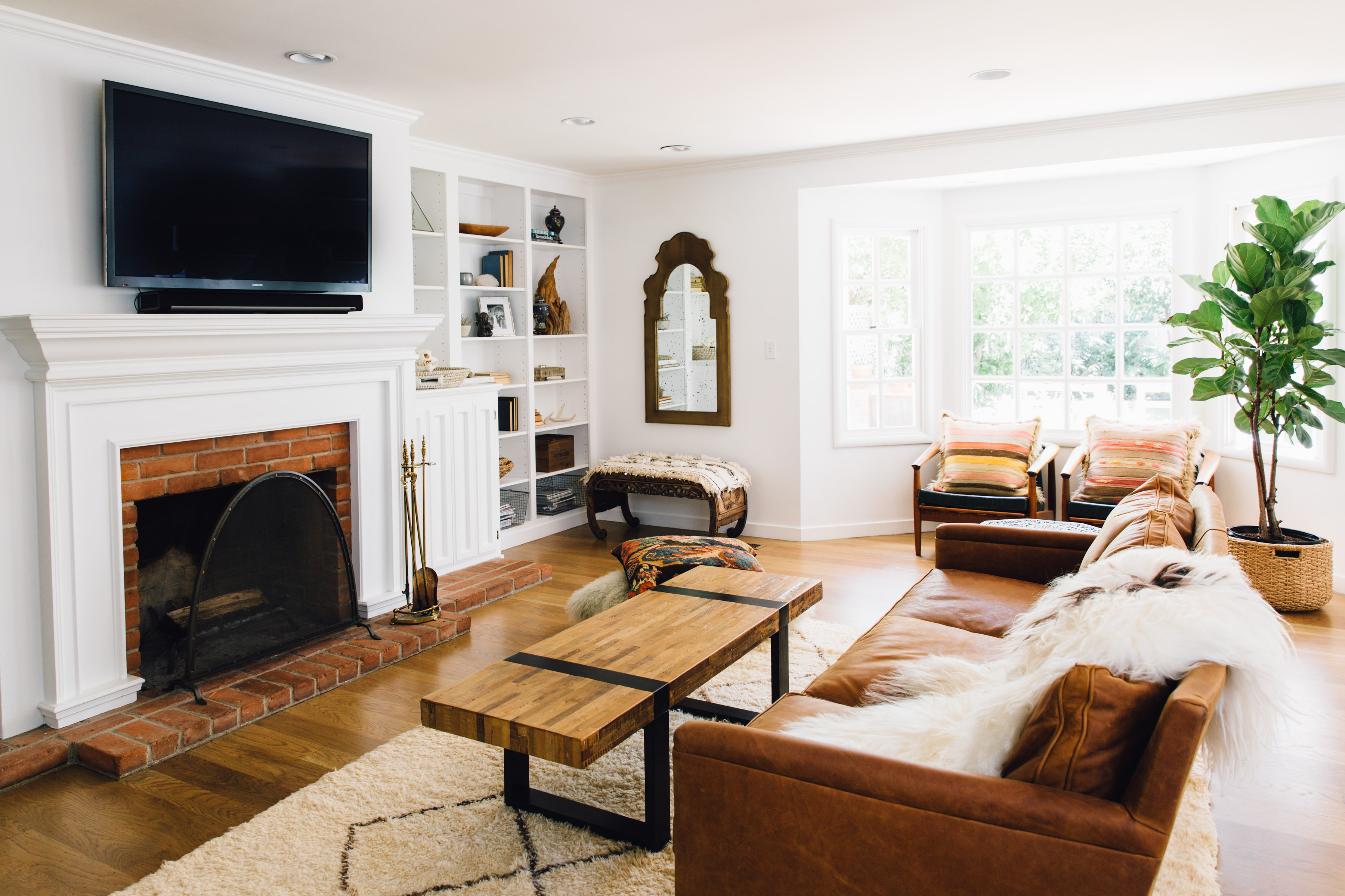
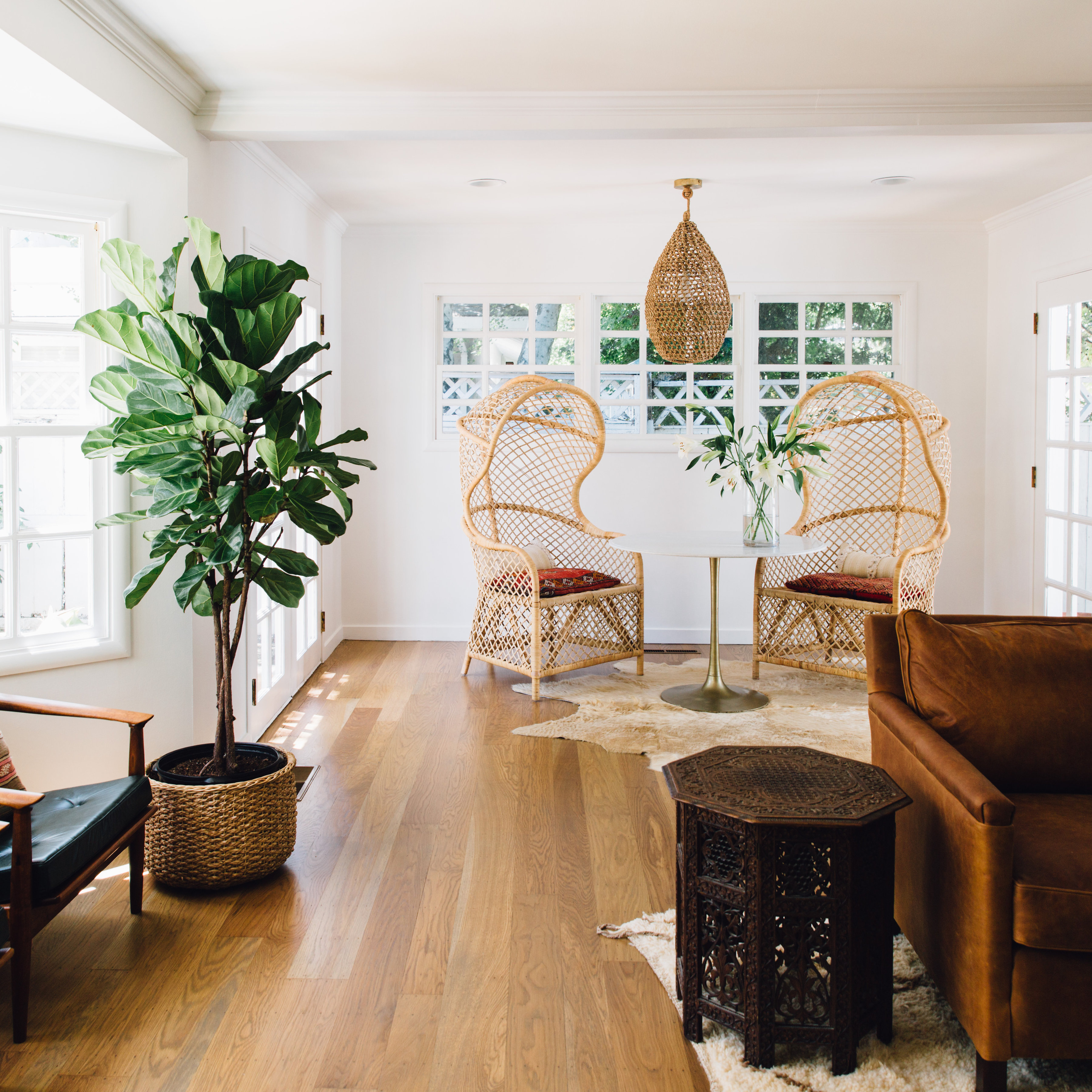
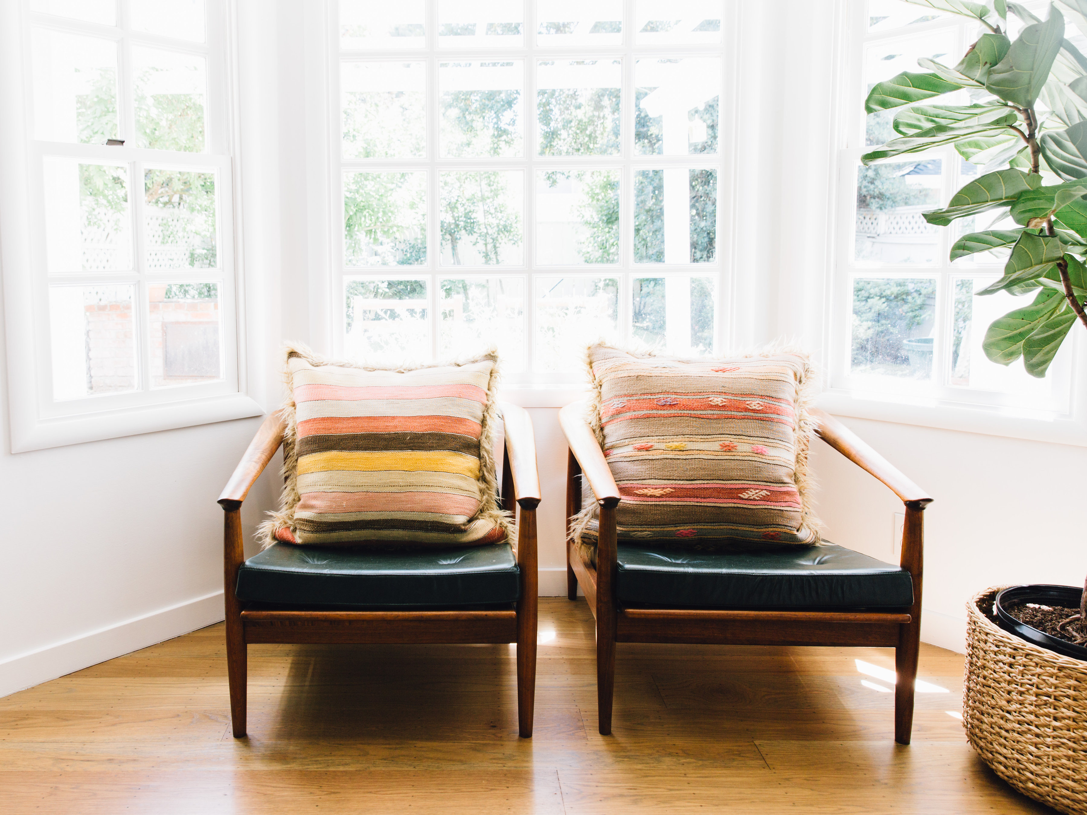
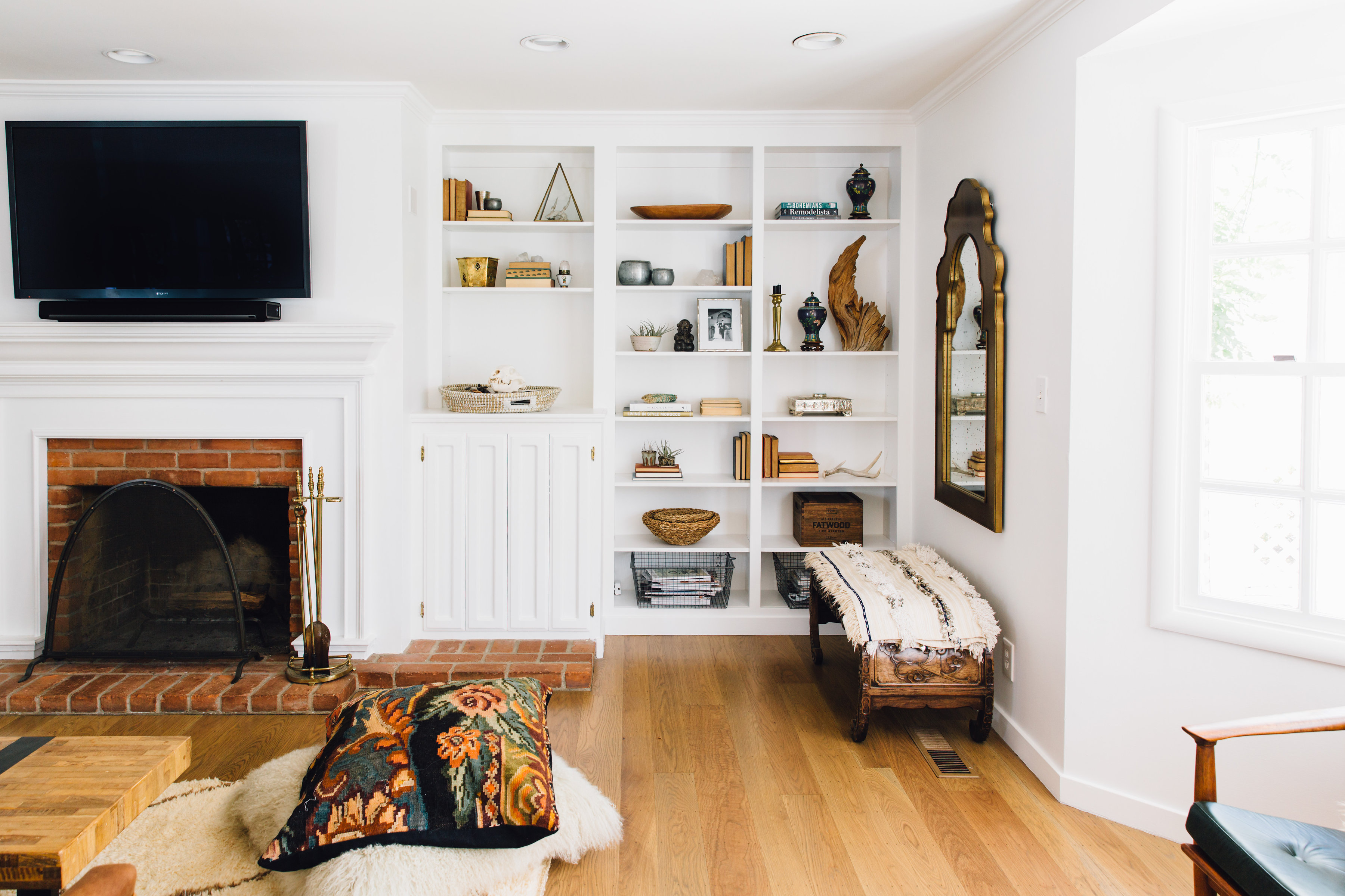
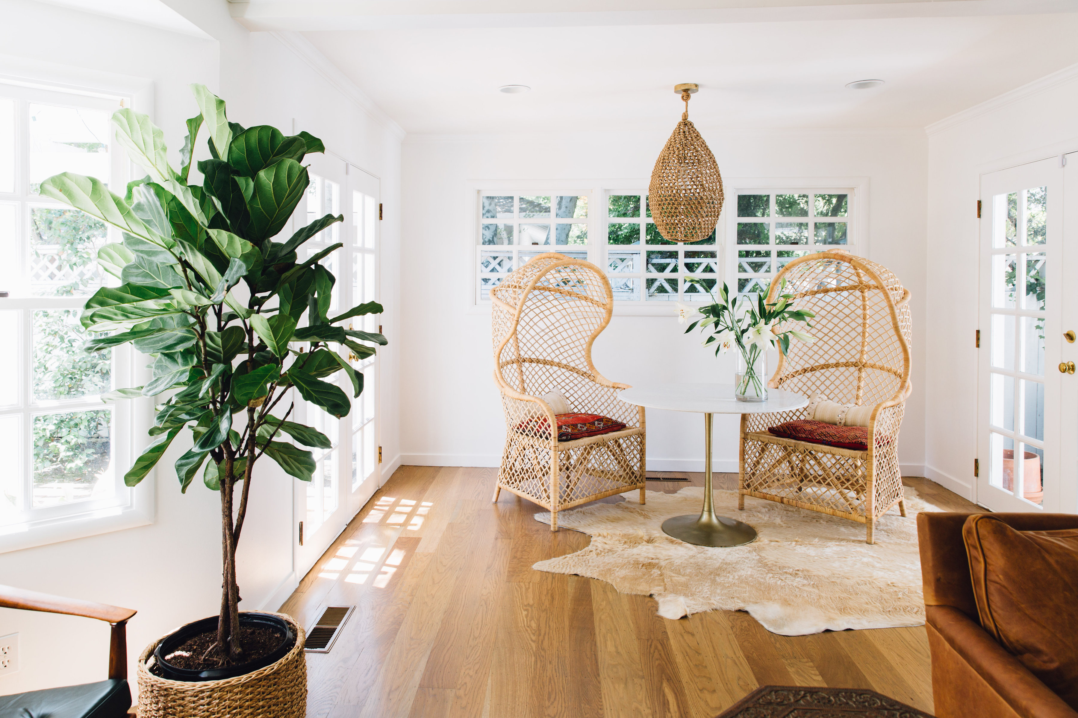
Family Room | The family room wasn’t part of the original house and was added on in the 80s. We didn’t change much about this room except for painting the yellow walls white and removing additional shelving at the back of the room to increase the size of the nook area.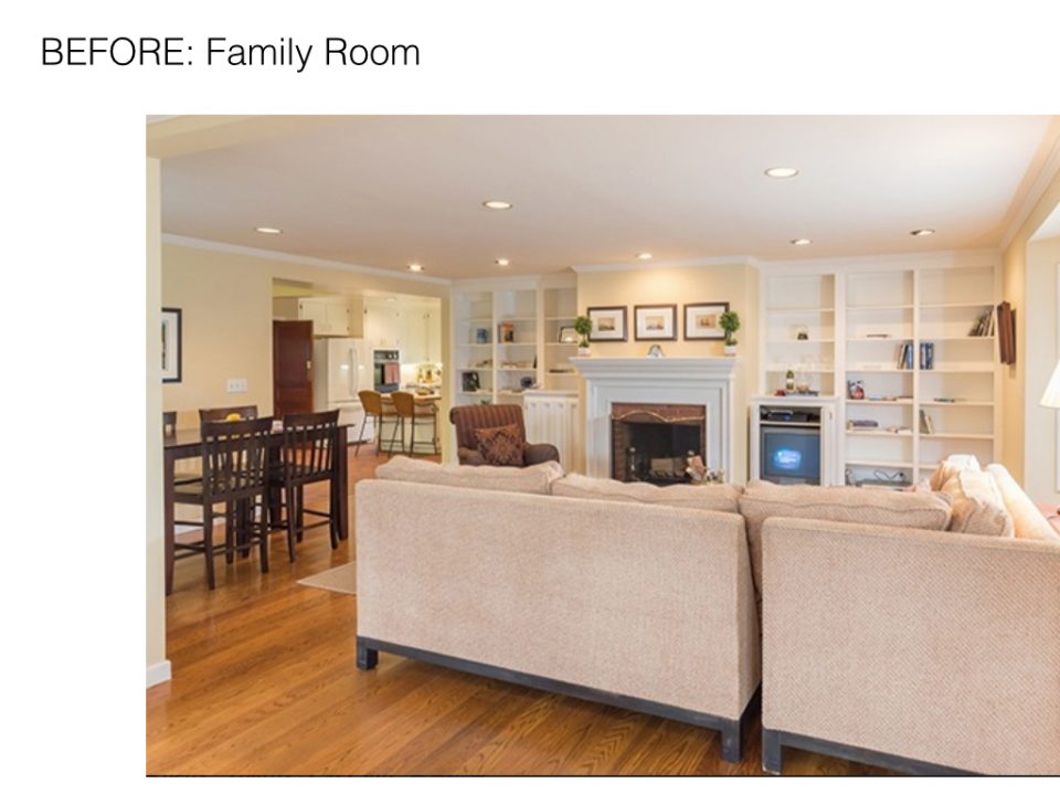
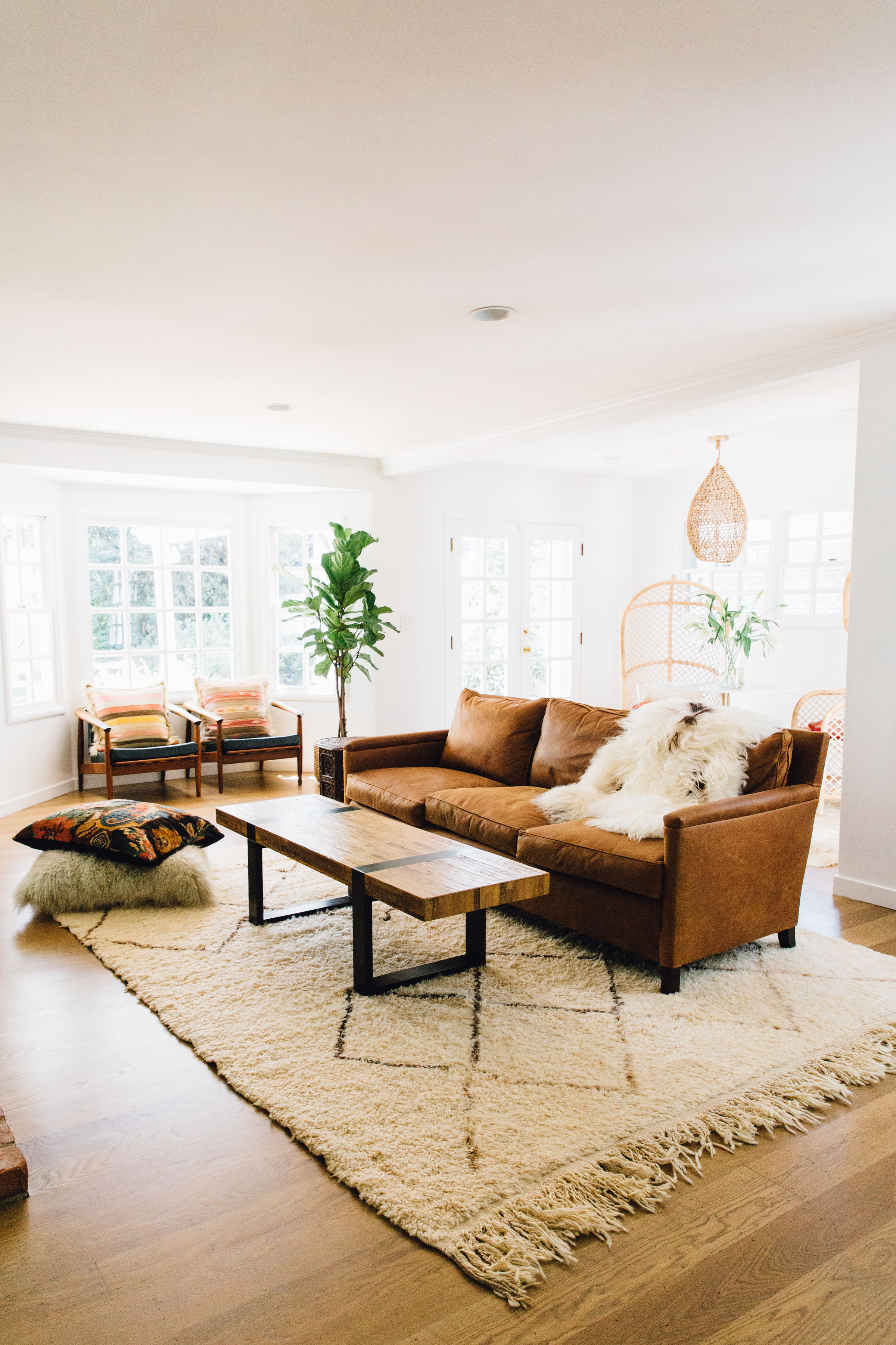
Details | Couch: ABC Carpet & Home. Rug: Kechmara Designs. Coffee Table: (old) Craigslist from Crate Barrel. Green Leather Chairs: Vintage. Woven Chairs: NOIR.
Photography | Stephanie Russo
