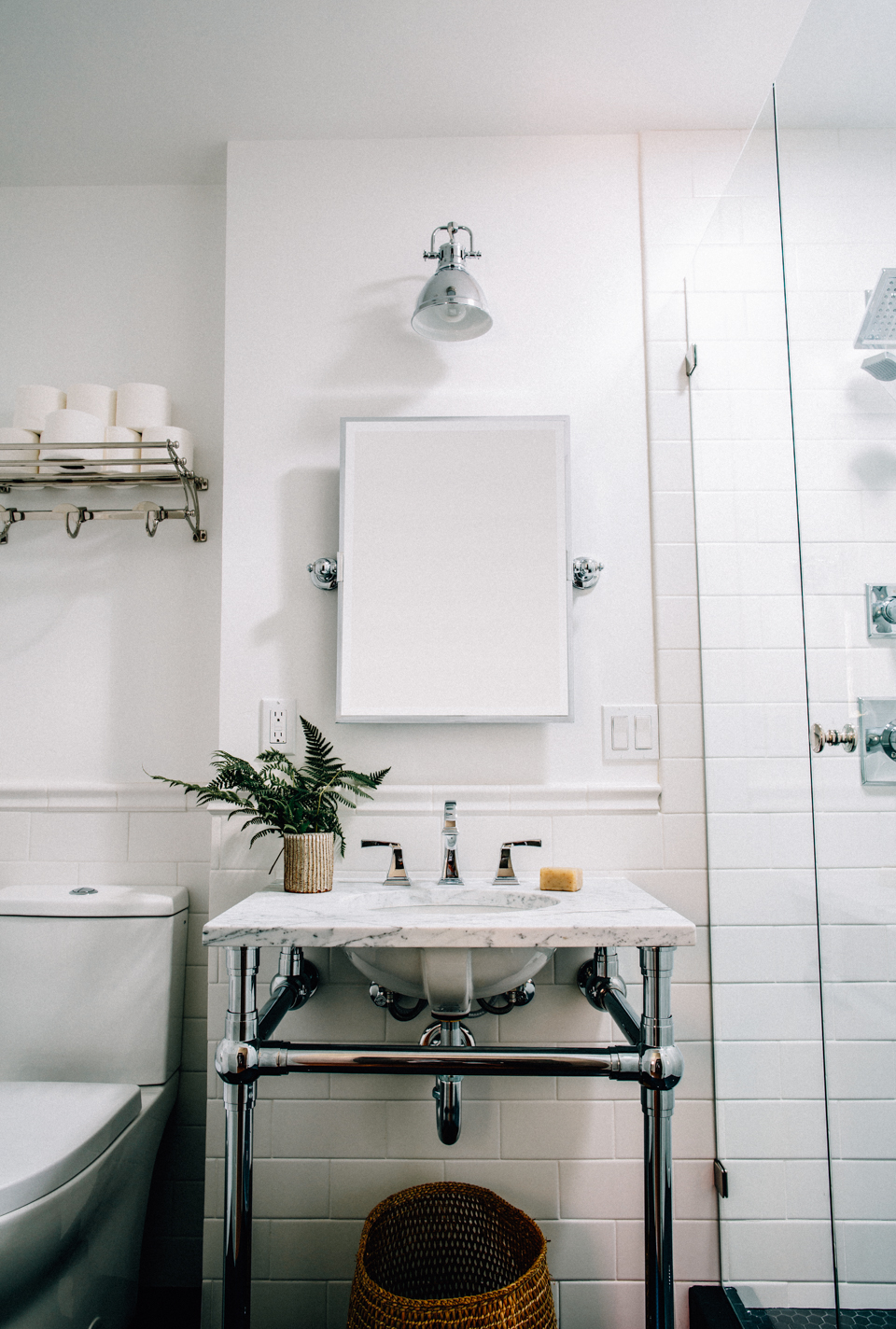
Besides the additional closet space that we added to our master bedroom this summer our home renovations also consisted of remodeling the upstairs guest bathroom (and Rex’s future bathroom). It was pretty gosh darn small beforehand and felt slightly claustrophobic when inside–oh, also the shower didn’t work–so it was an absolute remodel must if we wanted friends and family to come visit us. I was thrilled when Build.com reached out asking to work with us on the project and couldn’t be more in love with how it turned out! For those who may not be familiar, Build.com is a great site to source any home improvement items. They have everything you can imagine with a dedicated expert team on hand to help you design the room of your dreams. Plus, they happen to be based in my hometown… so there’s that! Super excited to finally share the reveal with you… which is also live on their site as well!
The creative process started with a mood board. I turned to Build.com to source tile, hardware, lighting, and a mirror that perfectly matched my vision. Their team was amazing to work with and helped me pull together items that are a complete reflection of my style.
The Inspiration | I wanted the bathroom to flow with the classic style of the house and keep with the mainly black and white color palette. I thought about various fun colors and tiles or ways to add a fun touch to this bathroom and ultimately kept coming back to black tiles. I pulled some of my favorite photos from Pinterest and sent them over to the Build team. Deborah from Design Alchemy (our friends and interior designer) also talked me into going with chrome for a more modern finish. I love that it is a nice change-up from the brass we have throughout the house and that it also feels masculine for a boy’s bathroom.
The Before | We went over various options with our contractor to see what was possible in the space and landed on these changes to make the bathroom feel as big and bright as possible.
Photography | Build.com
